
Mobile app redesign Betterhalf
A redesign of Betterhalf's 'Upgrade to Premium' page to decrease user drop-offs and boost premium memberships by enhancing the user experience and clearly presenting the value proposition.
Background
Betterhalf has two offerings: a matchmaking app and an end-to-end wedding planning service.
My role involved a phased redesign of the app. The frontend code was completely rewritten from JavaScript to React.js to address performance issues and improve extensibility. The premium plans page was a key focus of the redesign to increase paid memberships.
My role
UX Design, UX Research, UX Strategy, Prototyping, Usability Testing, Visual Design
Team
1 Designer, 1PM,
2 Engineers
Timeline
1 month

Before

After
Problem
The ‘Premium’ page faced significant drop-offs, with only 5% of users clicking the 'Upgrade' CTA. The issues were:
Unclear value proposition
Not flexible for sales
Not catchy or persuasive enough
Goal
The goal was to reduce drop-offs by improving the UX and UI. Objectives included:
Clearly showcase the value proposition
Allow easy modifications for different sales campaigns without heavy frontend changes
Make the page visually appealing and persuasive
Research
I analyzed upgrade screens from various competing apps, focusing on content hierarchy, plan options, and benefits.
A hook is essential to immediately convey the upgrade benefits, a clear list of inclusions enhances user understanding, a upgrade pages should look distinct to signify an enhanced experience.
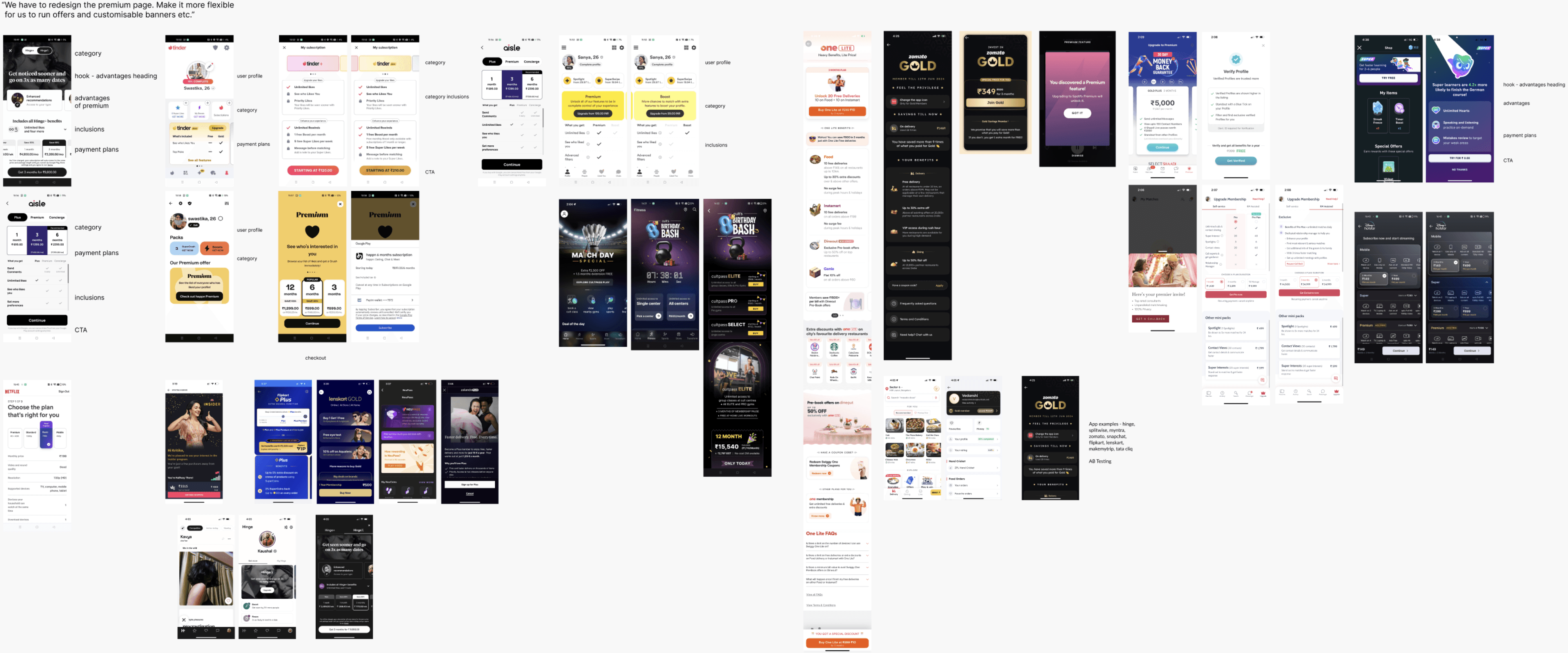
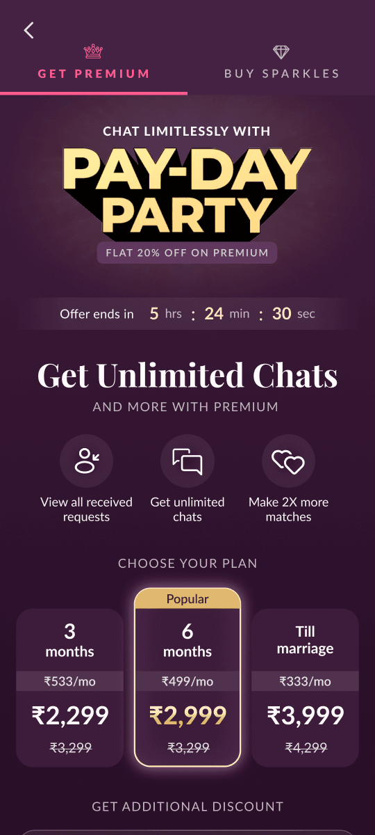
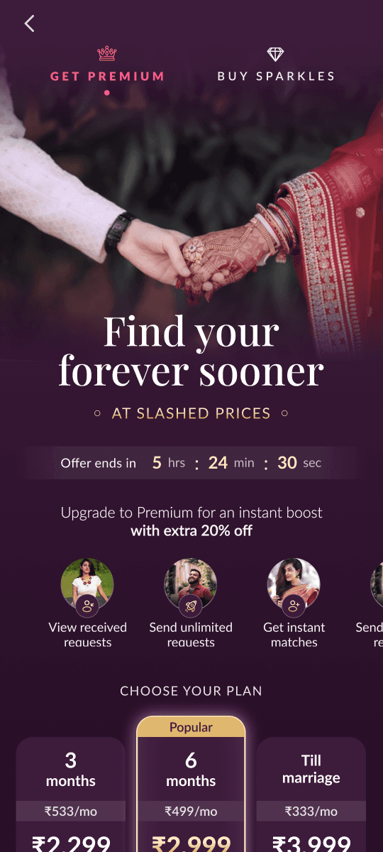
Final Screens
Distinct from the app: The redesign features a visually distinct, pleasant, and romantic look, enticing users to take the next step.
Strategic: Offered three plans (6-month, 3-month, and lifetime), utilizing the Centre Stage Effect to guide users towards the middle option and reduce distraction or decision fatigue. Applying coupon code was also made easier.
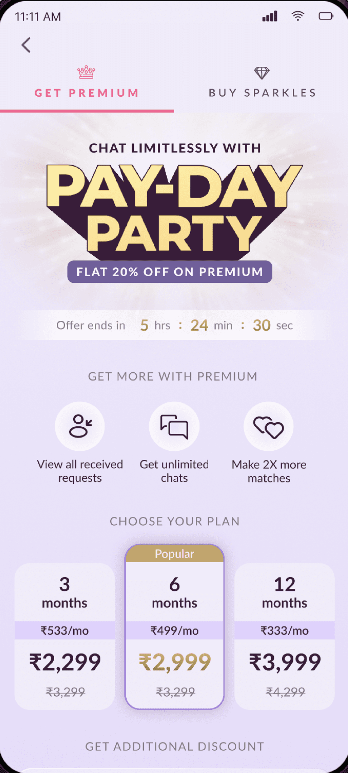
Customized for sale
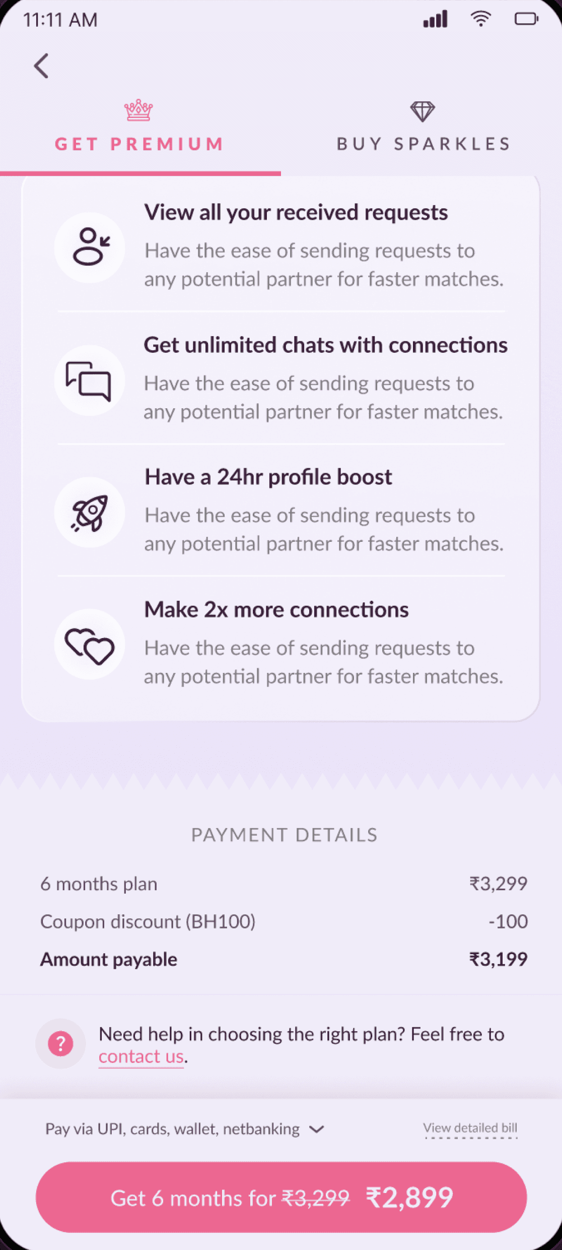
Premium inclusions
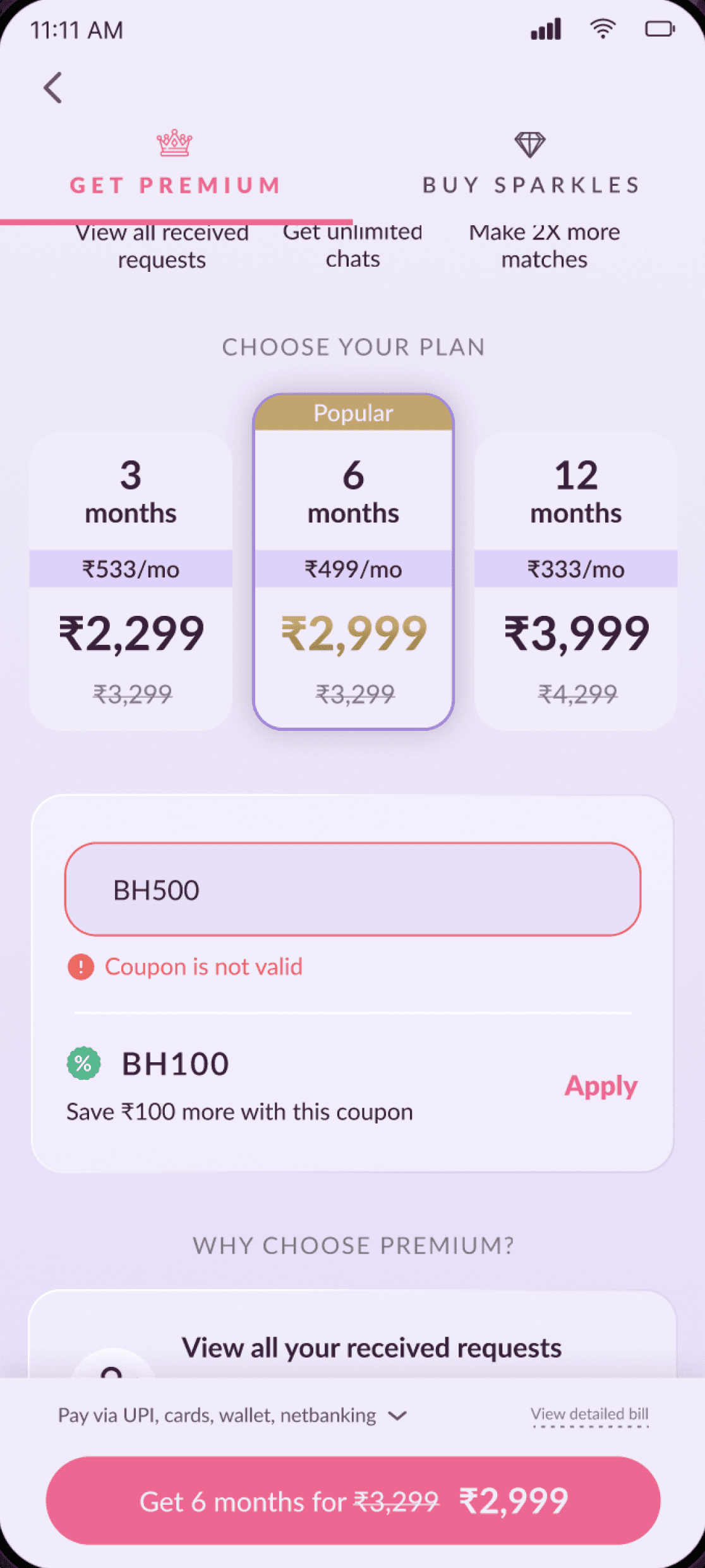
Invalid coupon
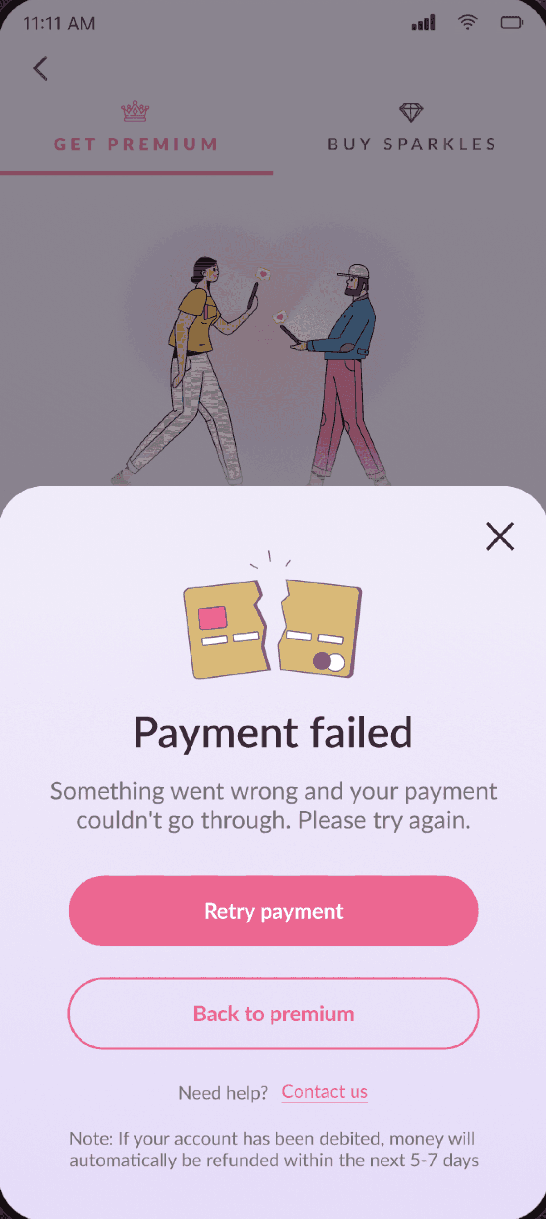
Payment failed

Discovery point

Discovery point
Iterations
Before finalizing, I explored many layouts, colour schemes, imagery, and iconography. My initial favourite was a dark mode page to give an exclusive, aspirational, and luxurious feel. But this approach was discarded for resembling e-commerce or fitness products rather than a romantic app.


Impact
Rolled out the updated payments page to 10% of users initially for A/B testing, it showed promising results.
After full deployment across iOS and Android, drop-offs reduced from 95% to 88%.